Ole Smoky Redesign

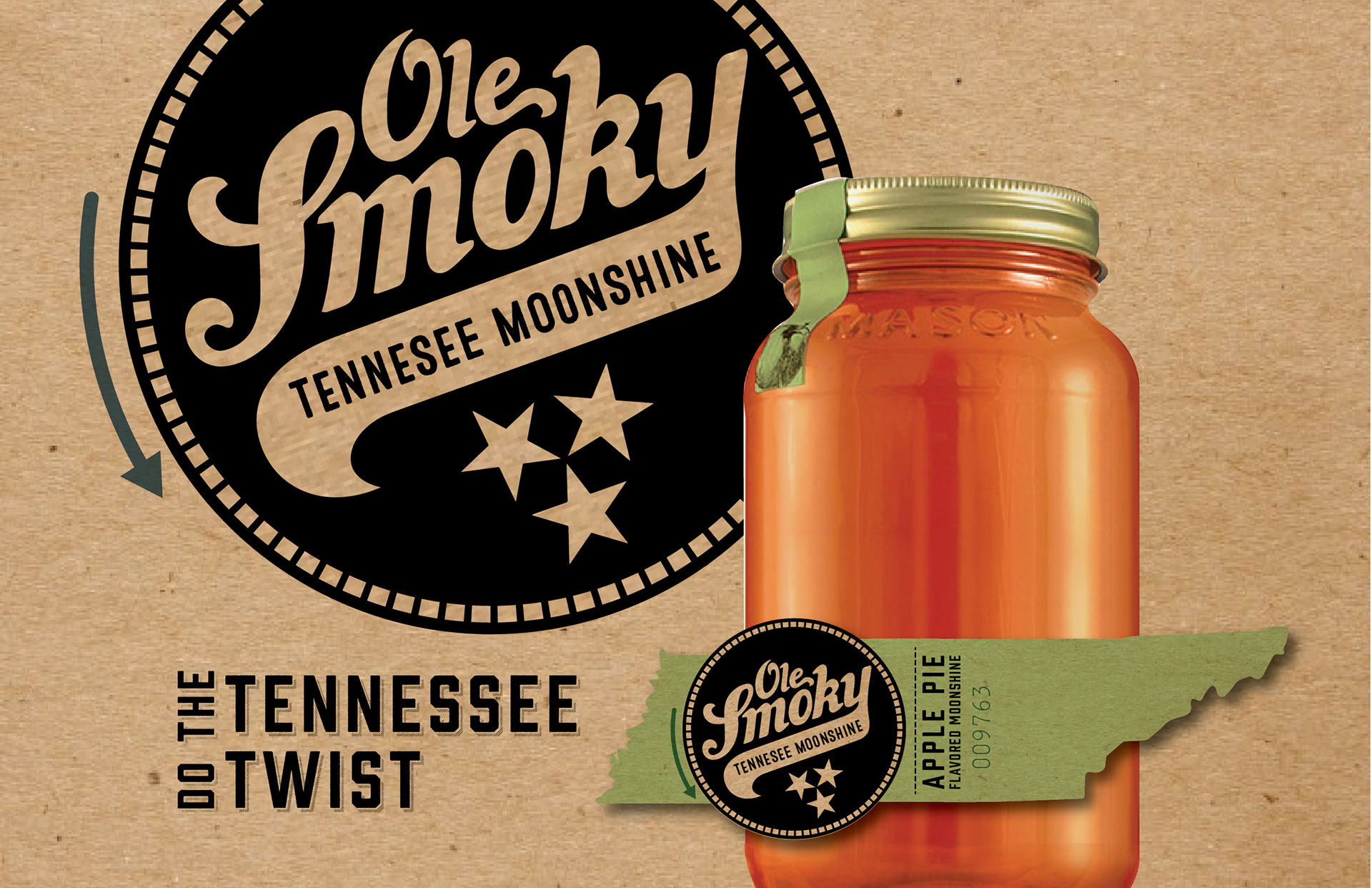
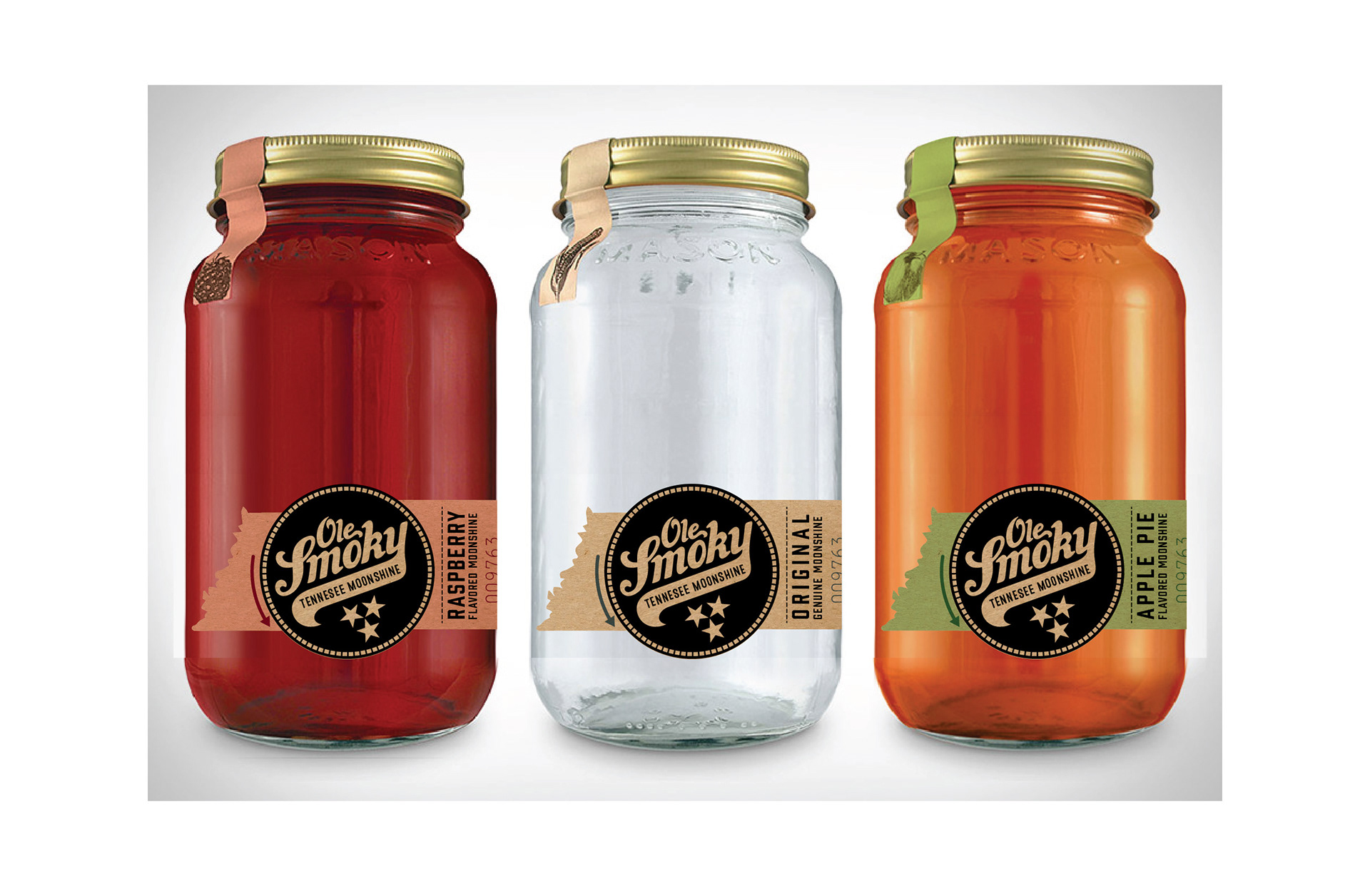
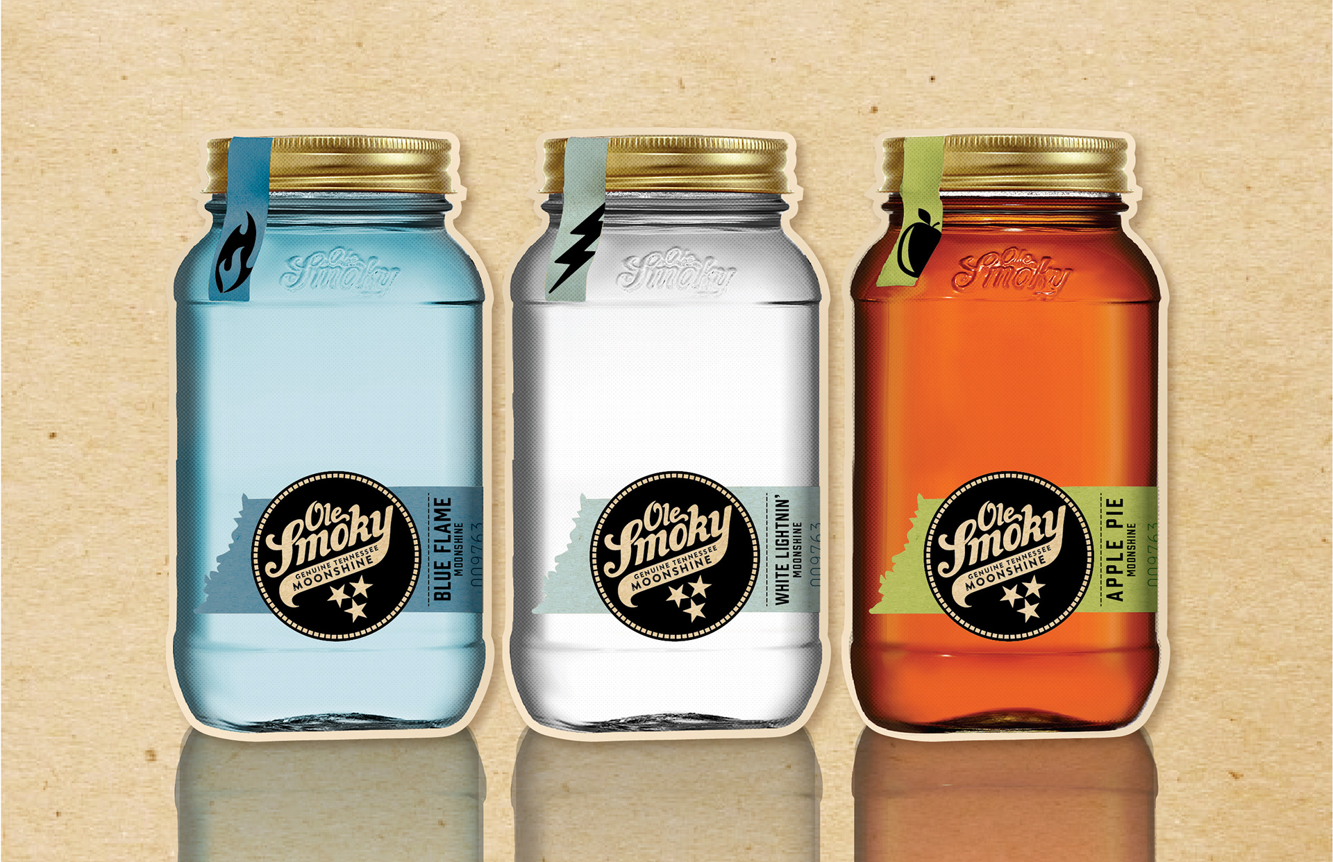
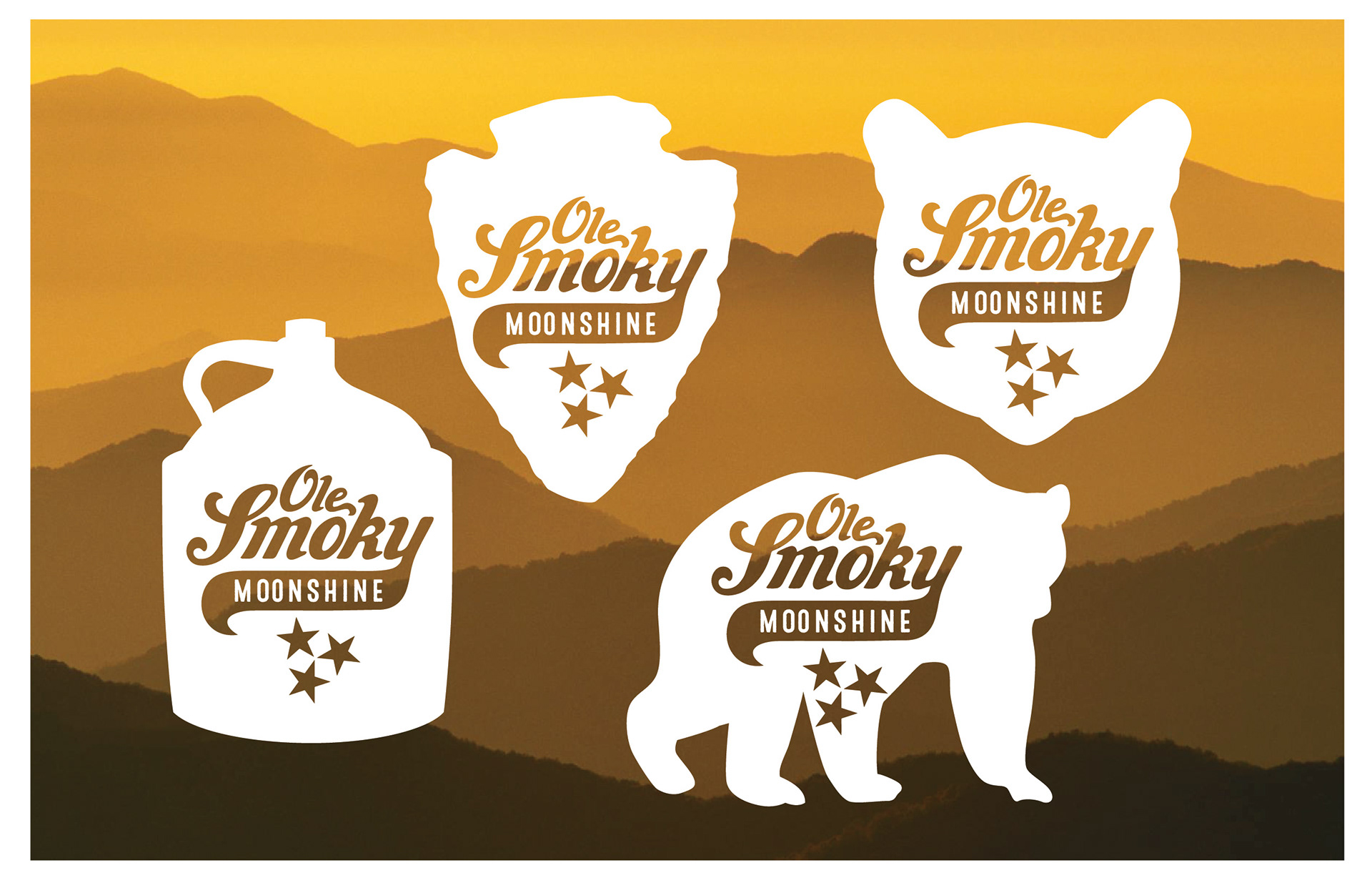
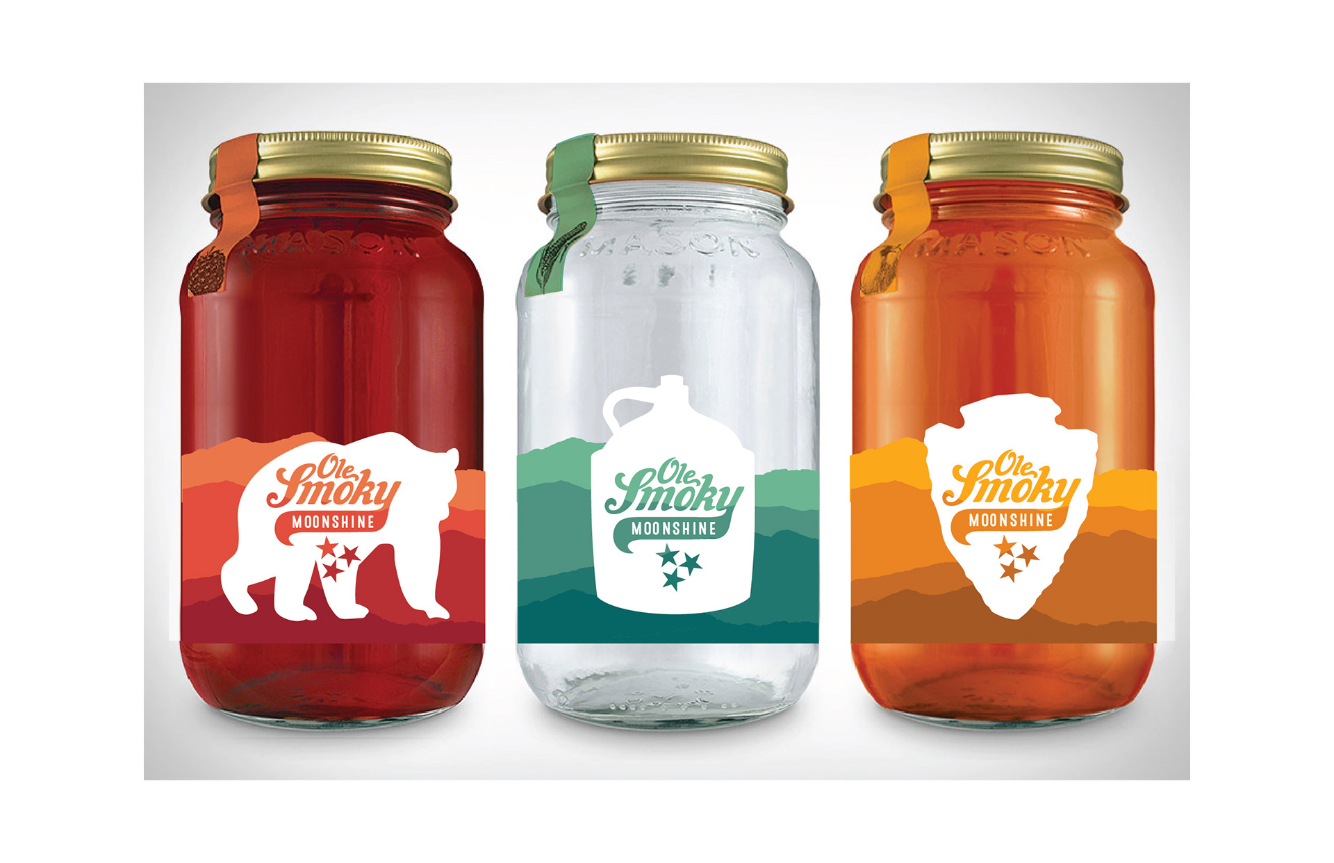
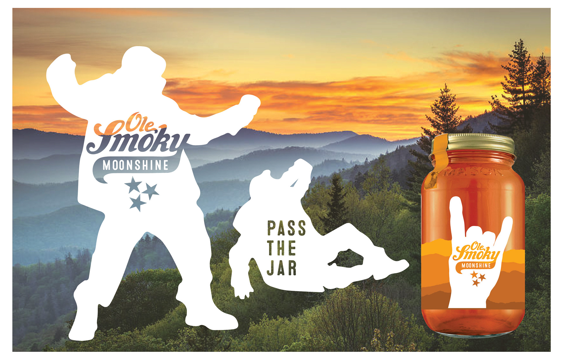
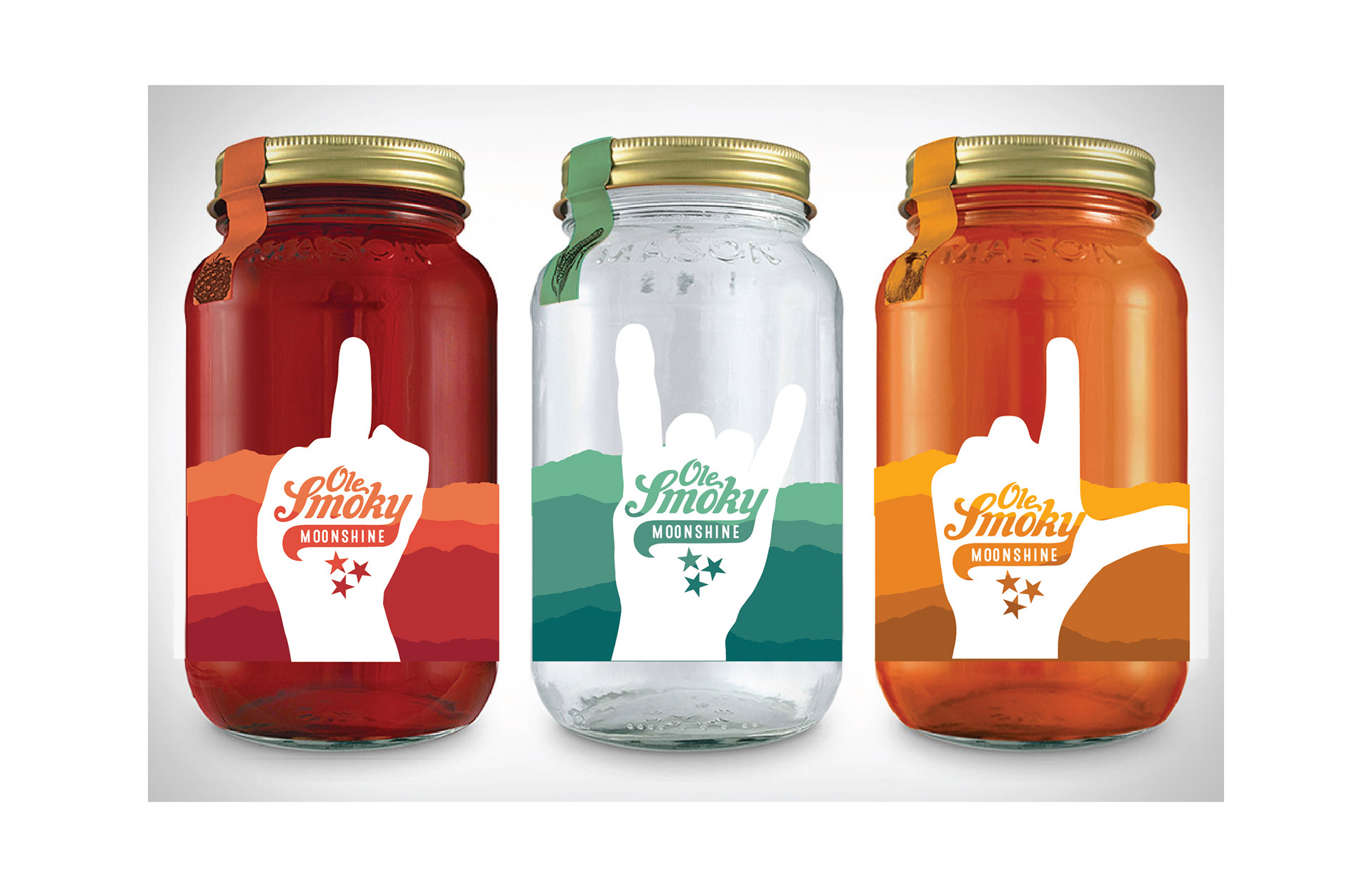
Baker was approached with an opportunity to redesign Ole Smoky Moonshine. I was assigned art director to the project and also contributed the design that was selected by the client: a concept called The Tennessee Twist. One of our insights was that the jar equity was not just important as a visual, but as a tactile and emotional experience. The sound of the lid twisting off, the smell of the product, and the notion of passing and sharing the jar all contribute to the brand experience. I set out to capture this in the brand mark: a circular shape representative of a jar lid, angled to appear as though it is being twisted. The state of Tennessee is where Ole Smoky is made, and represents an important equity for moonshine drinkers. I added the three stars of the state flag and shaped the entire label like an outline of Tennessee.

Early versions of the Tennessee Twist design featured a very prominent tail in the logo, a kraft paper color in the letterforms, and flavor colors in the label background.
The client was interested in creating campaigns involving the owner of Ole Smoky–Joe Baker. The #drinkswithjoe campaign would feature Joe secretly appearing at various bars that offer Ole Smoky moonshine and hanging out with customers.
Another one of my concepts that was presented in the original round. Each variety of moonshine would get its own unique silhouette shape.
The colored striations behind the silhouette are a depiction of the Smoky Mountains. The silhouettes themselves are all shapes unique to or iconic for the Smoky Mountain region of Tennessee.
A variation of the Smoky Mountain/silhouette idea was called "Pass the Jar." The silhouettes were more irreverent, and depict various hand gestures (some offensive) for each flavor.
Back to Top